Back in September, GDM Pipelines broke ground by becoming the first company to deliver on-demand risk assessments for every pipeline in Western Canada. Now, to expand on that enormous success, we are pleased to announce enhancements for users to visualize pipeline risk directly in the map.
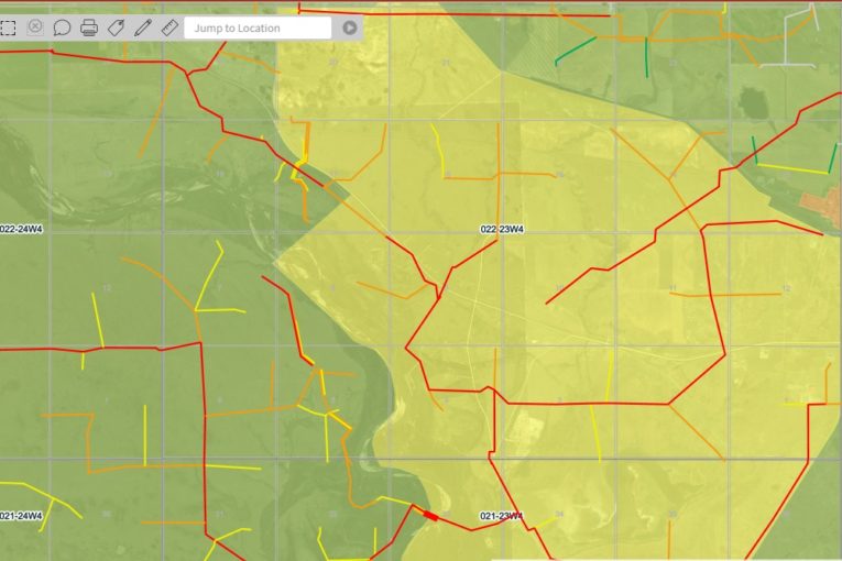
Every pipeline is color coded green, yellow, orange or red according to its risk score, so you can easily identify your highest priority pipelines. You can choose to view pipelines by their Overall Risk, Consequence or Likelihood scores.
Additional layers for high consequence areas such as Population Density, Protected Areas, Land Use and Aboriginal Lands have also been added to provide context to the associated risk profiles. And, you can drill down to each individual pipeline to get a detailed view of the factors that contribute to its risk score.
With risk profiles available for every pipeline, you can not only understand the risk associated with your operating assets, you also gain insight into the long-term liability for your overall oil and gas infrastructure.
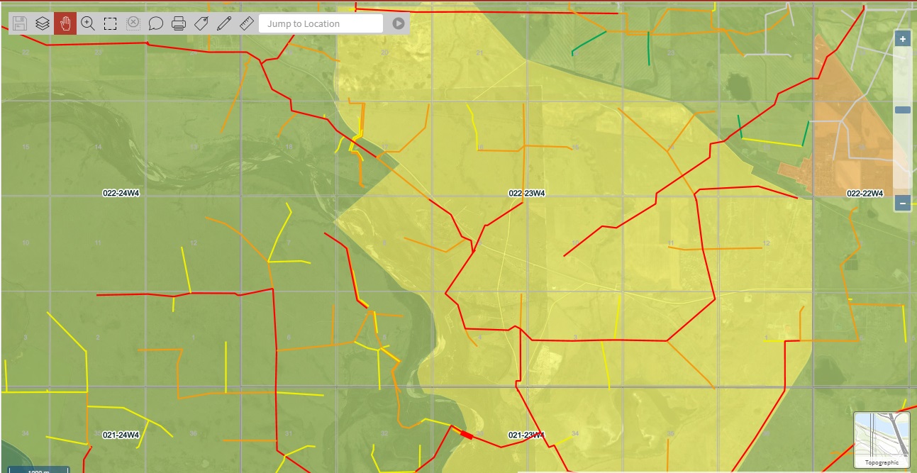
Pipeline Consequence with Population Density Layer in the background
Never has it been so easy to identify, view and manage the risk associated to your assets.
Want to learn more? Visit us in booth 421 at the NACE Northern Area Western Conference in Calgary on February 5-7.
Can’t make it to the show? Visit us online or contact us for more information or to schedule an in-person demo.
You can read more of the news on source